Use the Buttons block to add one or more buttons to your page or post. This block has been available since WordPress 5.4, when the button block was deprecated.

To add the Buttonsblock to a page, click the Add block button to open the block inserter pop-up window and choose the Buttonsblock.

You can also use the keyboard shortcut /buttons to quickly insert a Buttonsblock.
Detailed instructions on adding blocks
TheButtons block comes with one individual button block by default. You can customize the text, link, and style for this button. To add more buttons, click the plus Add block button in the bottom right corner within the Buttons block, and a new button will appear. Note that the new button will follow the same style as the existing button.
Block toolbar
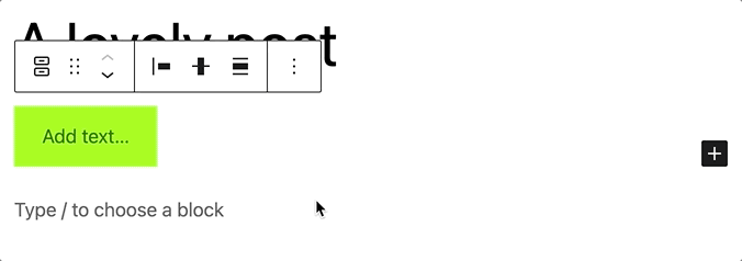
To view the block toolbar, click on the block, and the toolbar will be displayed.
Every block comes with unique toolbar icons and blocks specific user controls that allow you to manipulate the block right in the editor.The Buttons block has a toolbar for the individual button and a toolbar for the entire block.
For the entire block

The main toolbar for the entire block has the following buttons:
- Transform to
- Drag icon
- Move arrows
- Change items justification
- Change vertical alignment
- Align
- Options
Transform to
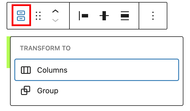
Click on the “Transform” button to convert the Buttons block into a “Group” or “Columns” block.
Drag icon

To drag and drop the block to a new location on the page template, click and hold the rectangle of dots, then drag it to the new location. The blue separator line indicates where the block will be placed. Release the left mouse button when you find the new location to place the block.
Move arrows

The up and down arrow icons can be used to move the block up and down on the page.
Get more information about moving a block within the editor.
Change items justification

The items justification setting allows justifying the buttons to the left, center, or right. There is also an option to “Space between items”. If it is selected, the Buttonsblock will be centered with equal spacing between the buttons.

Change vertical alignment
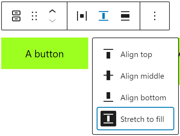
Use the change vertical alignment option to align buttons vertically with four possible options:
- Align top
- Align middle
- Align bottom
- Stretch to fill
Align
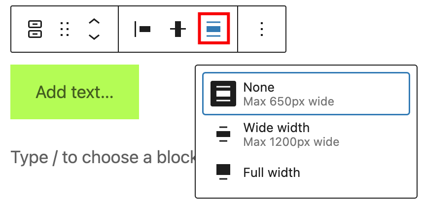
Use the change alignment tool to align the Buttonsblock. Choose one of the following options:
- None – leaves the block the current size.
- Wide width – increase the width of the block beyond the content size.
- Full width – extend the block to cover the full width of the screen.
The “Wide width” and “Full width” alignment settings must be enabled by your WordPress theme.
Options
The Options button on a block toolbar gives you more features to customize the block.

Get more information about other settings
For individual button

If you select a specific button, a new toolbar will appear with these new options:
- Change block style
- Link
- Bold
- Italic
- More Rich Text controls
- Options
Change block style

Use the change block style option to change the style of a particular button.
Link

Use the link option to add a link to the button. It’s also possible to set it to open the link in a new tab
Bold

You can select the text in the Buttons block and use the “Bold” option or “Ctrl+B” / “Cmd+B” on your keyboard to bold it, which is usually heavier than the surrounding text.
Italic

You can select the text in the Buttons block and use the “Italic” option or “Ctrl+I” / “Cmd+I” on your keyboard to italicize it, which usually appears slanted to the right.
More rich text options
The drop-down menu to the left of the More options menu contains a range of additional rich text editing options such as highlighting, inline code, strikethrough, and more.
Read about more rich text editing options.
Options

The Options button on a block toolbar gives you more features to customize a specific button.
Read about these and other settings.
Block settings
The block settings panel contains customization options specific to the block. To open it, select the block and click the Settingsbutton next to the Publishbutton.

When the entire Buttons block is selected, you have the Layout, Typography, Dimensions, and Advanced customization settings.
For the entire block
When the entire buttons block is selected, you have the Layout, Dimensions, and Advanced settings for customization.
Layout
TheButtons block provides layout settings to change item justification and orientation.

When a specific button from the Buttons block is selected, you have the Styles, Width, Color, Typography, Dimensions, Border, and Advanced customization settings.
This article provides details about layout settings.
Color
TheButtons block provides Color settings options to change the text and background colors

See this guide for more information about changing colors.
Typography
TheButtonsblockprovides typography settings to change the font family, size, appearance, line height, letter case, letter spacing, and decoration.
Get more details about changing typography settings.
Dimensions
TheButtons block provides dimensions settings options to change padding and margin size.
Learn more about dimension controls.
Border
Border settings provide options to control the width and radius on each side of the button.

Learn more about border settings.
For individual button
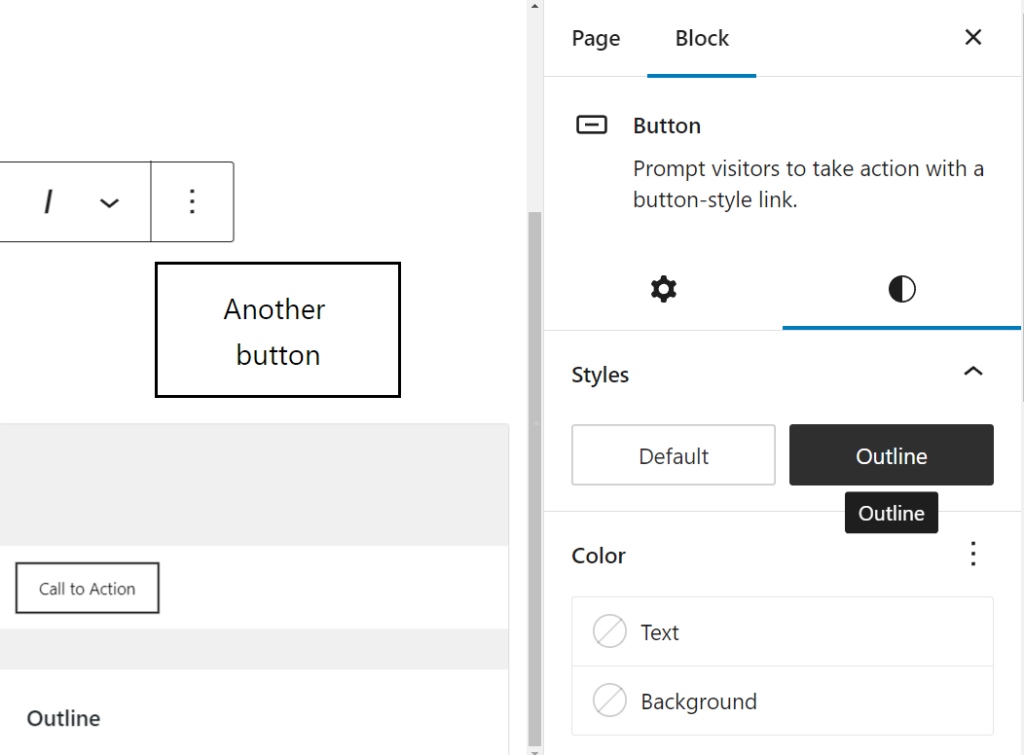
Styles settings
It’s possible to change the individual button style. Hover over a particular style to see how it looks.
Width settings

Each button can have its own width setting inside the buttons block based on a % value.
Advanced settings

You can add a Link rel attribute to each button in the block. This is a more advanced feature that enables to control the button link’s rel attribute, The rel attribute defines the relationship between a linked resource and the button. Eg: for rel attributes are nofollow,external,stylesheet,pingback,preload,prefetch,prev etc
You can also add HTML anchor and CSS class(es) to each button in the block.
HTML anchor allows you to make a unique web address for an individual button. Then, you’ll be able to link directly to that button on your page.
TheAdditional CSS class(es) lets you add CSS class(es) to your button, allowing you to write custom CSS and style the button as you see fit.
Based on which style you choose for the button block, WordPress automatically adds a CSS class to that button block. You can find the class in the Advanced settings panel under Additional CSS class(es). You can also add additional classes with spaces.
Changelog
- Updated 2023-11-21
- Updated screenshots for 6.4
- Updated 2023-11-11
- Updated title in sentence case
- Updated 2023-06-09
- Replaced “More rich text options” section with short summary linking to new dedicated page for rich text editing options.
- Updated 2023-03-07
- Revised formatting for the whole article
- Updated content and all screenshots for 6.2
- Updated 2022-11-22
- Change alignment for images
- Replaced redundant content
- Updated 2022-08-18
- Updated content, screenshots, and videos for 6.0.
- Added explanation for adding individual buttons and style preservation.
- Added new block toolbar options.
- Added images and info for space between items and change vertical alignment.
- Added details for the block settings sidebar info.
- Updated info for the More options for the individual button block.
- Removed Text Color from the block toolbar for the individual button block.
- Added ALT tags for the images.
- Updated 2022-02-15
- Updated screenshots to 5.9
- Updated video to 5.9
- Added new settings for previous versions
- Added Live example